
Photo by Noah Buscher on Unsplash
Using the frontend toolkit Bootstrap can help you to easily create your user interface (UI). But the default Bootstrap’s styling does not give your UI the personal touch you are sometimes looking for.
To achieve a more unique interface, you can customize Bootstrap. And this isn’t a drag.
There are two ways of doing this, Sass variables or CSS variables. In this post we’ll walk you through customizing Bootstrap 5 with CSS variables.
TLDR: view our Git repository for example code
CSS vs Sass variables
Customizing Bootstrap 5 with Sass variables has probably more advantages than customizing with CSS variables. But then you need some setup for processing Sass files to CSS files. We will come back to the disadvantages of CSS variables.
In our case, we wanted to customize Bootstrap without Sass, so we chose to change CSS variables.
Simple setup
To start create two files, a HTML page and a stylesheet file. Figtree is used as font, so we load this as well via Google Fonts.
<!-- index.hml -->

<!doctype html>
<html data-bs-theme="light">
  <head>
    <meta charset="UTF-8" />
    <meta name="viewport" content="width=device-width, initial-scale=1.0" />
    <link rel="stylesheet" href="style.css" />
    <link
      href="https://fonts.googleapis.com/css2?family=Figtree:ital,wght@0,300..900;1,300..900&display=swap"
      rel="stylesheet"
    />
  </head>
  <body></body>
</html>
/** style.css */

@import url("https://cdn.jsdelivr.net/npm/bootstrap@5.3.3/dist/css/bootstrap.min.css");
Find available CSS variables
Most of Bootstrap’s components can be customized with CSS variables.
Bootstrap’s documentation contains a overview of available variables for each component.
Customize the root
/** style.css */

:root {
  /* Our app variables */
  --app-body-bg: #f1f2f5;
  --app-font-brand: "Figtree", sans-serif;
  --app-color-brand: #7440f3;
  --app-color-brand-rgb: 116, 64, 243;
  --app-color-brand-hover-rgb: 56, 24, 136;

  /* Overwrite Bootstrap variables */
  --bs-body-bg: var(--app-body-bg);
  --bs-primary: var(--app-color-brand);
  --bs-primary-rgb: var(--app-color-brand-rgb);
  --bs-font-sans-serif: var(--app-font-brand);

  --bs-link-color: var(--app-color-brand);
  --bs-link-color-rgb: var(--app-color-brand-rgb);
  --bs-link-hover-color-rgb: var(--app-color-brand-hover-rgb);
}
Customize button component
The button component has local CSS variables on .btn for customization. Each .btn-* modifier class can also be customized.
First we add a hover color for our button to :root. This variable is used in the button and the button variants.
/** style.css */

:root {
  /* ... */

  --btn-hover-color: #4414b9;

  /* alternative for hex color, calculate color with hsl()  */
  --btn-hover-color: hsl(
    from rgb(var(--app-color-brand-rgb)) h calc(s - 8) calc(l - 20)
  );
}
After that, customize the CSS variables for the button and button variants:
/** style.css */

.btn {
  --bs-btn-padding-x: 1.5rem;
  --bs-btn-padding-y: 0.75rem;
  --bs-btn-border-radius: 0.75rem;
}

.btn-sm {
  --bs-btn-padding-x: 1rem;
  --bs-btn-padding-y: 0.5rem;
}

.btn-primary {
  --bs-btn-bg: var(--app-color-brand);
  --bs-btn-border-color: var(--app-color-brand);
  --bs-btn-hover-bg: var(--btn-hover-color);
  --bs-btn-hover-border-color: var(--btn-hover-color);
  --bs-btn-active-bg: var(--btn-hover-color);
  --bs-btn-active-border-color: var(--btn-hover-color);
}

.btn-link {
  --bs-btn-hover-color: var(--btn-hover-color);
  --bs-btn-active-color: var(--btn-hover-color);
}
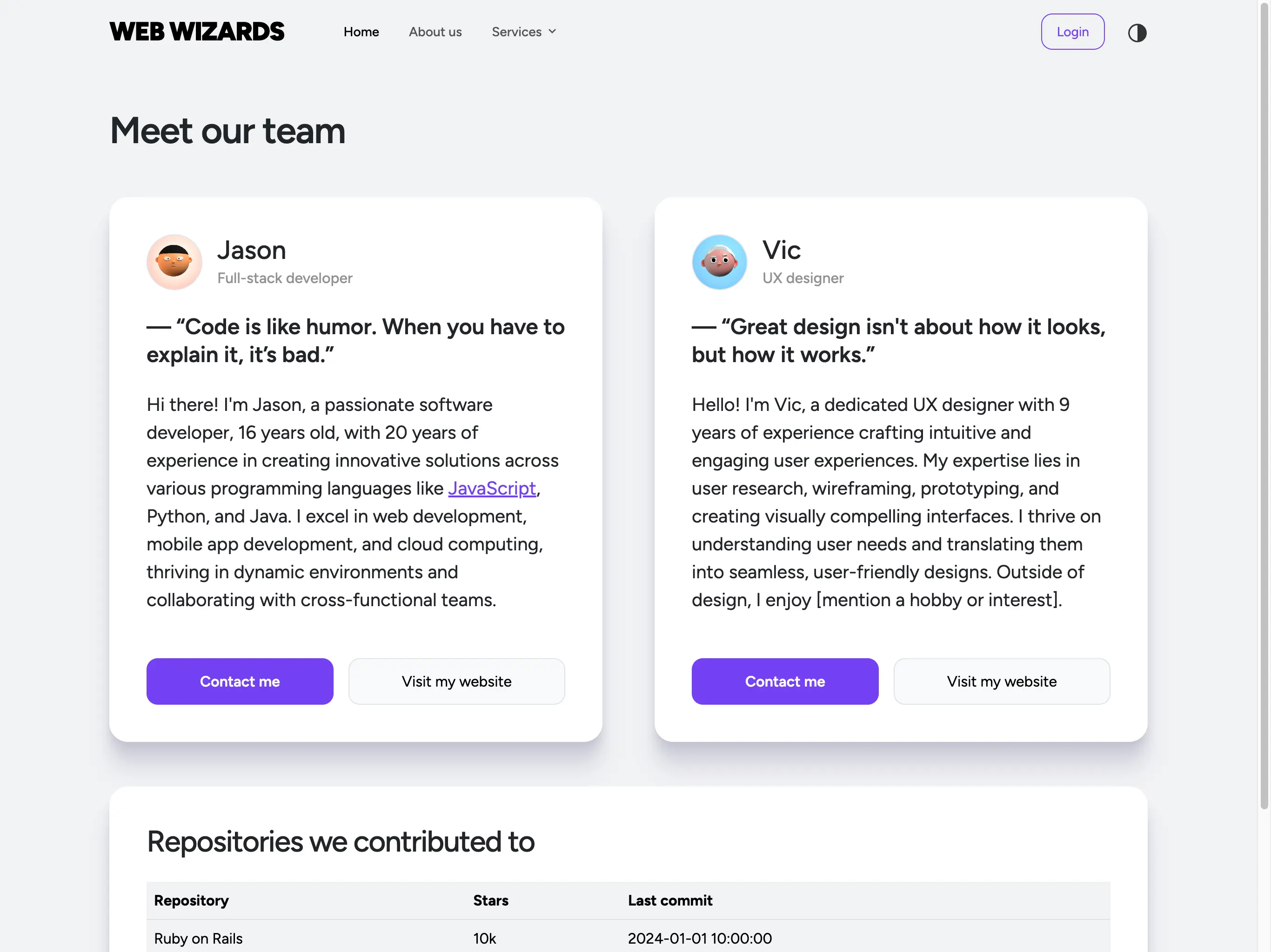
Before / after example
Below you see customized button. Customizing other components can be done in the same way.

Disadvantages of CSS variables
The usages of CSS variables instead of Sass variables has some drawbacks. Not all Sass variables have a CSS alternative.
Also, with CSS variables you have to set hover colors and add RGB values for some colors. In Sass you only have to set $primary if you want to change the primary color and everything will be changed for you.
Example code of Bootstrap 5 customization
We hope you found our Bootstrap 5 customization explanation inspiring and helpful.
We’ve created an example where the navbar, buttons, cards and a login form is customized. It also has a light / dark mode setup.
View example code in our Git repository
Bonus: a helpful extension
When you use Visual Studio Code, there is a helpful extension for Bootstrap.
It’s called Bootstrap IntelliSense and offers CSS class autocompletion, reducing errors and more.